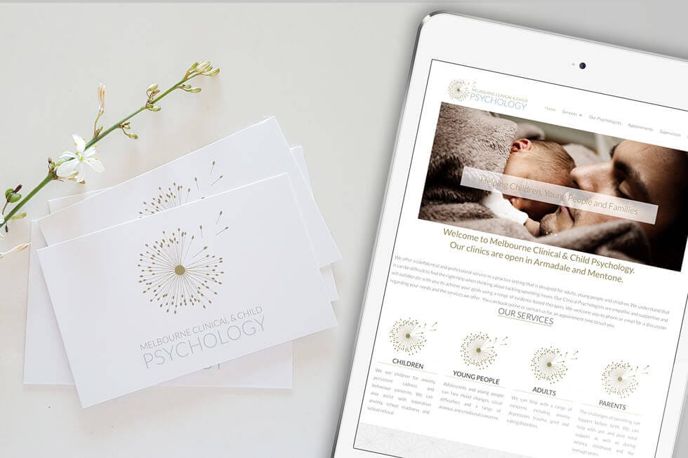
The team at Melbourne Clinical & Child Psychology (MCCP) approached me for their rebranding of their clinic in Armadale and Mentone.
They help children, young people and families by providing support guidance and treatment in the form of Clinical Psychology services. They also support psychologists and counselors through supervision to develop their own skills and knowledge and to be further develop as health professionals.
They had a branding and Wordpress website created by the principal psychologist, Nellie, that she thought were too DIY. So we set up by researching what the competitors are doing in term of the branding, our own target market and specifically the values that MCCP holds that we want to convey in the brand.
Nellie know she wants geometric lines and circles to represent brainwave, all wires that are connected into one mind — to represent psychology.
Initial concepts presented are below.
We decided to actually soften it up and giving it more of feminine and family oriented whilst still using the idea of geometric, cirles, lines and branches. The end result is so gorgeous I think we hit the nail!
The logo is dandelion – we are using gold colour and blue as the main colours.
The business cards are printed on the 400 luxurious artboard with matte finish.
And lastly, the website is now looking all professional and has the consistent brand all over the page. As client is familiar of Wordpress, it makes a lot of sense to stick with it.
Melbourne Clinical & Child Psychology Wordpress Website Design & Development


